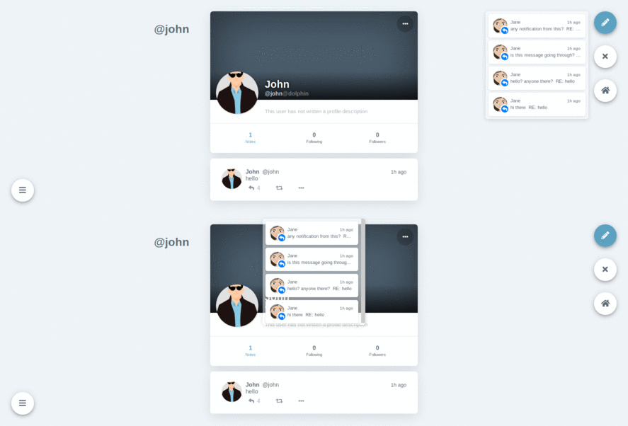
This is the desktop view

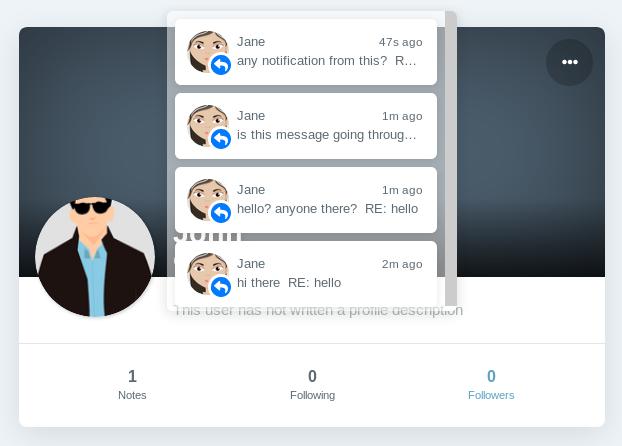
The notification pop up is centered at the top and covers up the profile
For desktop view, there is enough space on the right side.
Will that work better?
This is the desktop view

The notification pop up is centered at the top and covers up the profile
For desktop view, there is enough space on the right side.
Will that work better?
Will submit changes that will do the following @syuilo
-match top of notification to the top of timeline
-move notification to the right for tablet and desktop view
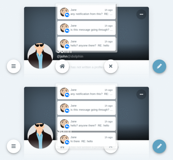
-increase height to fit four notifications (default) and remove scroll bar
-decrease height to three notifications when viewing in mobile landscape view to avoid blocking buttons

